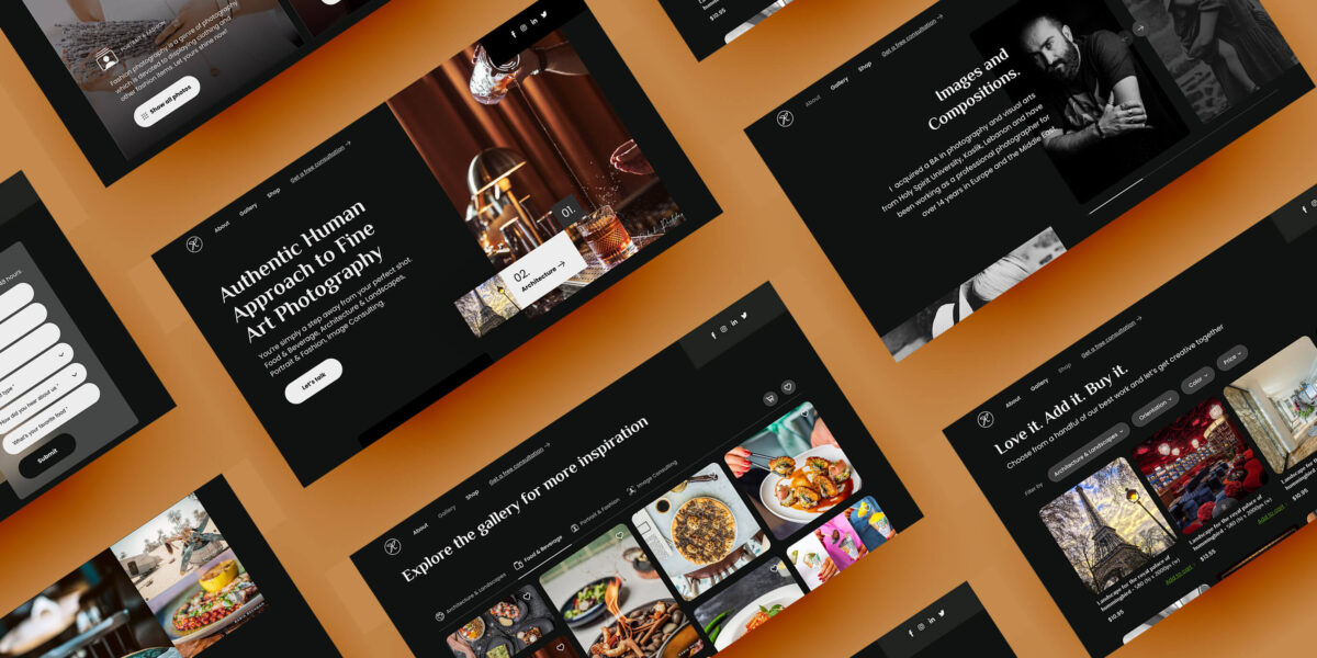
The easier your website is to use, the more people use it.
Now, there’s nothing – and everything – wrong with a complete redesign of your website.
-
-
It costs a lot, custom-made.
-
It takes a lot of time – and delays.
-
What happens in 2-5 years? You’ll do it all over again.
-
So here are the stages you need to focus on that will save you the hassle, and remember it all comes down to Research, Design, Test, and Repeat.
1. Understand Your Customers (Research Analysis)

You may think you know what your end-users feedback on using your website or product is, but in reality, your end-user knows better. So ask away. Collect as much data from him as possible so that you base your design decision on that, and not on random guesses. Validate your value proposition because that will drive your messaging throughout all your web pages.
In order to design websites that our users find intuitive, you need to learn about their behaviors and how they prefer to interact with your website. Remember:
People spend most of their time on other websites.
Might as well imitate and enhance, and make certain design principles are well applied.
2. Craft Your Messaging (Copywriting)
You may think you know what your end-users feedback on using your website or product is, but in reality, your end-user knows better. So ask away. Collect as much data from him as possible so that you base your design decision on that, and not on random guesses. Validate your value proposition because that will drive your messaging throughout all your web pages.
When you can successfully articulate your brand in simple, powerful language, you can communicate effectively with the people you’re trying to reach and, ultimately, convert them into your lifelong customers.
Your value prop is simple: It explains both the functional and emotional benefits your product or service provides—the value people get from it. It specifies exactly how your brand solves a problem, who it caters to, and most importantly, why people should choose you.
Some examples:
Grammarly > Great Writing, Simplified.
Loom > Loom on. Meetings off.
Shopify > If you can dream it, you can sell it with Shopify.
Pinterest > Get your next home decor idea.
Canva > Design anything. Publish anywhere.
3. Wireframe & Polish it (UX/UI)

For better conversion, better usability on the web, and a better user-centric approach to design, layout and flow, I’ll leave you with a resume of 10 usability heuristics as stated by Jakob Nielson, a user advocate and principal of the Nielsen Norman Group.
1. Visibility of system status
• Interactive mall maps have to show people where they currently are, to help them understand where to go next.
(Keep the user informed, you don’t want him to get lost and abandon your site)
2. Match between the System and the Real World
• On a stovetop, users can quickly understand which control maps to each heating element.
(Use words, phrases, and concepts familiar to the user. Don’t re-invent the dictionary)
3. User Control and Freedom
• Just like physical spaces, digital spaces need quick “emergency” exits too.
(Users o en perform actions by mistake. They need a clearly marked “emergency exit” to leave the unwanted action)
4. Consistency and Standard
• Check-in counters are usually located at the front of hotels, which meets expectations.
(Follow platforms conventions. If giant tech companies are using it, follow that. Your user is used to using their websites more than yours)
5. Error Prevention
• Guard rails on curvy mountain roads prevent drivers from falling off cliffs.
(Good error messages are important, but the best designs carefully prevent problems from occurring in the first place. Be proactive in anticipating the user’s behavior)
6. Recognition Rather Than Recall
• People are likely to correctly answer “Is Lisbon the capital of Portugal?”
(Minimize the user’s memory load by making elements, actions, and options visible. Avoid making users remember information)
7. Flexibility and Efficiency of Use
• Regular routes are listed on maps, but locals with more knowledge of the area can take shortcuts.
(Shortcuts may speed up the interaction for expert users)
8. Aesthetic and Minimalist Design
• A minimalist three-legged stool is still a place to sit.
(No need to go fancy and all-out on animations, illustrations and artistic graphics if they don’t serve a purpose on the page. If the sofa is taking a lot of space, a stool can still do it)
9. Recognize, Diagnose, and Recover from Errors
• Wrong-way signs on the road remind drivers that they are heading in the wrong direction.
(Error messages should be expressed in plain language -no error codes-)
10. Help and Documentation
• Information kiosks at airports are easily recognizable and solve customers’ problems in context and immediately.
(It may be necessary to provide documentation to help users complete their tasks, but try making it so intuitive that no additional piece of documentation or help is needed)
4. Develop & Deploy (Development)
At this stage of the process, you’ll bring all your hard work – planning, designing, and copywriting – to life. Code it with page speed load in mind. Code it with page performance in mind. Code it with built-in SEO parameters in mind. What I’m trying to say is Code it as if your life depends on it.
As you might have seen from the research that you initially completed, your users are either majority on the run using their mobile or sitting at a desk – remotely or in-office – and browsing through sites. Landing on your websites should be a breeze. They’re getting in and out and without hesitation grasping the information needed to complete their task: Be it to make a purchase, know more about your business, or even gather contact information to establish communication.
5. Test & Iterate (Agile)
Maybe you’re not too sure about your hero headline. Maybe your hero visual is too dominant. Maybe your call-to-action button color is not doing it. Whatever it may be, it’s not on you to decide. Test it. Send it. Collect feedback. Run a 5-sec test on it – use Maze for that matter – and benefit from real people’s opinions on whether to change that image or re-write that copy.
It’s never over. You’ll never be satisfied. Your website – or your company’s website is like a pantry; Every now and then, inventory should be made and elements would be thrown away and other items will be replaced. Test, Iterate, keep notes, enhance, and keep updating that digital store.
As a wrap-up
Two words: Originality and usability
Adapting and creating emerging patterns can lead to exciting and delightful designs. But designs must be accessible, easy to use, and ultimately support the goals that users are trying to accomplish.
Think of your website as your salesman.
It has to be quick, look slick, and answer customers’ questions in a jiffy.
It’s not an art gallery for someone to ponder about and hang around, it’s “I’m in, got what I need, I’m out. What an experience!”
Appreciate letting me know how you found this post in the comments below.
As always, I’m your brand strategist, your certified UX designer, and your photographer at heart. Reach out with any questions or projects you may have and I’ll be happy to help 🙂


